Steven Jos PhanCreative Director, Experience Designphansteve at gmail dot com
04 February 2025The Nature of Time

Assignment 1

Timekeeper Collection and Analysis
Find and post four timekeeper designs you like. These could be watches or clocks of interest; time-based art installations you’ve experienced; astronomical historical sites; etc. Choose one in particular to discuss in class next week. Carefully analyze how it presents the time. If a watch or clock, consider specific details like the typography, indices, proportions, and materials. Are there complications? Have at least one physical and one digital example.


Image
Object to be Destroyed / Object of Destruction by May Ray
May Ray - Object to be Destroyed / Object of Destruction

From Wikipedia: “The metronome...was probably secondhand when Man Ray reconfigured it as an art object, as it was marred, worn, missing minor parts and stood on mismatched feet, though its mechanism was in fair working order.

“The original Object to Be Destroyed was created in 1923. According to Man Ray, the piece was intended as a silent witness in his studio to watch him paint. In 1932, the year Man Ray's lover Lee Miller left him to return to New York, a second version of the piece, called Object of Destruction, was published in the avant-garde journal This Quarter, edited by André Breton. This version featured an ink drawing with the following instructions:

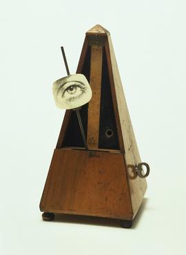
Cut out the eye from a photograph of one who has been loved but is seen no more. Attach the eye to the pendulum of a metronome and regulate the weight to suit the tempo desired. Keep going to the limit of endurance. With a hammer well-aimed, try to destroy the whole at a single blow.

To make the connection to Miller more explicit, the object's original eye was replaced with a photo of hers. This remade piece was exhibited for the first time at Galerie Pierre Colle in Paris as Eye-Metronome in 1933. The remake was lost in 1940 during the German invasion of Paris. A subsequent replica was exhibited as Lost Object in 1945. Man Ray stated that he had always intended to destroy it one day, but as a public performance.
 
Just as the color and shape of an icon for a text file do not entail that the text file itself has a color or shape, so also our perceptions of space-time and objects do not entail (by the Invention of Space-Time Theorem) that objective reality has the structure of space-time and objects. An interface serves to guide useful actions, not to resemble truth…For the perceptions of H. sapiens, space-time is the desktop and physical objects are the icons. Our perceptions of space-time and objects have been shaped by natural selection to hide the truth and guide adaptive behaviors. Perception is an adaptive interface.” 

A metronome is a literal example of a chronos as its designed to measure the passage of time and guide and moderate human action. Man Ray’s conceptual take on a metronome allows him to both indulge and overcome the loss of love. By affixing his former lover’s eye to the hand of the metronome, it taunts him. The passage of time since his lover‘s departure is painfully marked. The piece would not be complete without Ray’s instructions for the how the piece would meet it’s demise effectively symbolizing Ray’s symbolic victory over the opression of time, loss and failed love. 


Image
Teshima Art Museum by Office of Ryue Nishizawa 
Office of Ryue Nishizawa - Teshima Art Museum

From Architectura Viva: “Gently nestled on a site of soft contours, with its shape this museum mimics how a droplet of water falls on the rice fields that characterize the landscape of the Japanese island of Teshima, in Seto Inland Sea. 

Two light shells of white concrete measuring 25 centimeters thick and with organic forms, aside from a small buried reception area, accommodate the museum facilities, connected by a path that offers views of the natural environment and different perspectives of the project. The largest ‘droplet’ harbors the only exhibition hall, an open-plan and intense space of 40x60 meters with two elliptical openings cut out of the domed roof surface. These large outdoor openings give views of the exterior and bring the outdoor life inside – light, breeze, rain and fauna. 

The museum was designed to constitute an artwork that interacts with the environment’s atmosphere, merging landscape, art and architecture in a spatial entity. To build the domes the first step was to make a cast of hardened earth and mortar with the volume of the spaces to be covered and to be used as formwork, and which was removed after the reinforced concrete was set.” 

Although not often considered for how it marks the passage of time, the architectural design team of Teshima Art Museum studied the sun and how it would affect the experience of the space from within at different times of the year. The light cast through each of the oculuses moves, bends and contours as the year unfolds offering a uniquely new, albeit subtle, experience every day. 
.

The sun study shown above illustrates the movement of the illuminated shape within the structure at different times of the year. Although maybe not a typical example of a kairos, I’d like to make the case for this being a kairos with infinite perfection. There isn’t one perfect moment to  experience with this time piece, but instead a constantly unfolding meditation on what it is to be connected with the natural world. 


Image
Untitled (Perfect Lovers) by Felix Gonzalez-Torres
Felix Gonzalez-Torres - Untitled (Perfect Lovers)

From Public Delivery: “The piece is a moving comment on his private life. It symbolizes the artist’s HIV-positive partner Ross Laycock and his dawdling decline and inevitable death from AIDS. The two clocks represent two mechanical heartbeats, which are illustrative of the two lives ordained to fall out of sync and carry moving poetry about personal loss and the temporal nature of life.”

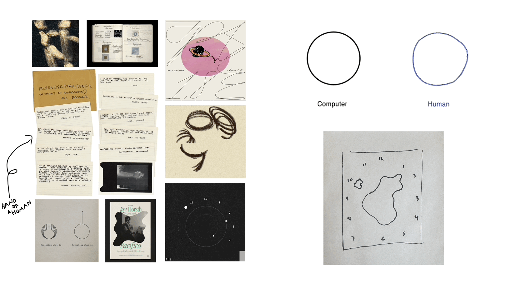
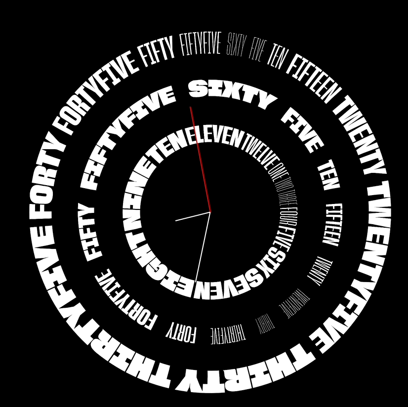
Don’t be afraid of the clocks, they are our time, the time has been so generous to us. We imprinted time with the sweet taste of victory. We conquered fate by meeting at a certain TIME in a certain space. We are a product of the time, therefore we give back credit where it is due: time. We are synchronized, now forever. I love you.

– Felix Gonzalez


To me, this piece is a marvelous work of art in the way that it communicates such intense emotional sentiments in the most simplistic way possible. I’m floored with how it conveys human yearning and desire for love to carry on forever juxtaposed with such a powerful metaphor in the weakness in our early form – in this case represented by the weakness and fragility of the clocks in their ability to keep up with one another. Inevitably one will fall out of sync with the other and eventually one will die. In a last ditch effort to suggest that, after all, love is infinite, the instructions for presenting this artwork stipulate that if either clock dies the metaphorical couple should be replaced and sync’d once more – a touching image of rebirth and renewal. Can I argue this is a kairos? It’s not telling time as much as it’s marking infinite themes of love, loss and fragility. 


Image
Freestyle Shark Watch

There’s nothing too special about these. I desperately wanted one when I was about ten and was obsessive about them. It’s really just a simple digital watch that’s water resistant. They came in tons of colors and were crazy popular with kids where I grew up in suburban NJ. I think they crushed the fad game and there isn’t much more to their secret. 

Definitely a chronos – no big monumental event happening here. 


Timekeeper Design


Create and post 2 of your own 2-D timekeeper designs. Digitally (but not in code yet), or with physical media (hand-drawn, cut paper). Do your designs depict kairos or chronos? (Or something else… see reading below).

Image
The Desert Waterfall Conceptual Clock
Desert Waterfall Clock

This design plays on a concept known as Pumped Storage Hydropower. 

An elevation water storage battery, also known as pumped storage hydropower (PSH), is a system that uses excess electricity to pump water from a lower reservoir to a higher reservoir.

Water that is pumped into the elevated Tank “Battery” trickles out of it’s tank at a predefined, understood rate and into a series of smaller tanks. Those tanks have overflows that are mapped to the amount of water that would fill the tank in the desired time span. For example, once the seconds bucket fills to 60 seconds, it would tip and overflow into the minutes bucket. Once that fills to 60 minutes, it would tip and overflow into the hours bucket and so on and so forth. Once the water overflows out of the years bucket, it would return into a reservoir pond where it lies in wait until it is pumped back to the tank “battery. 

The entire system would be built in a desert environment where sunlight is abundant and corrosion is limited. 

This would be an example of a Chronos clock. It’s also a modern incarnation of a Clepsydra which translates roughly to “water thief”.


Image
Organic Illumination Conceptual Clock
Organic Illumination

This timekeeping device is designed to appear simple, and almost rudimentary at first glance. It’s materiality would give the essence of nature and suggest a high level of craft and attention to detail. Behind the natural screen material, would be a series of tiny light bulbs that, when illuminated, cast a slight glow through the semi-translucent material of the screen. The screen would have a loose grid built into its structure. In learning how to read the grid, the observer could tell the time based on which illuminated bulbs are on at any given time. 

This would also be an example of a Chronos clock. 


12 February 2025The Design 

Assignment 2

Design 1: Gnomon Clock


For my thesis, I’m exploring the potential of variable typefaces as a creative, computational medium. In essence, a variable font is one that contains one or more variation axis each representing an expression of a single aspect of a typeface’s design. These axis can be set to be fixed or manipulated in-real-time with code which is what I’m exploring in my work. 

This clock is built atop some preexisting materials that helped get this concept off the ground quickly. First off, I found an existing variable typeface called Gnomon that came prepackaged with a foreground and background “layers” which essentially manifest as two different font files. The foreground contains no axes to manipulate. The background, however has two that can be affected: length of shadow and position of shadow. In implementing this typeface, I had to build the logic around how the current time of the clock correlated to the position of the shadow around the Gnomon clock. For the sake of the animation above, I sped the overall length of a day up to 15s so that we could see the entire shadow casting cycle. The shadow cast is designed such that there is no shadow before 6a or after 8p loosely coordinated around the actual length of the daytime portion of the day.

Here is a github link to my code. 
Here’s a live version. 

Design 2: Variable Font Clock


This clock uses a different variable typeface that have axes that allow me to control for height, width, weight and many other qualities. In this example, I’ve mapped height and weight to each individual numeral. You’ll notice that as the seconds tick higher, the weight and height of that specific letterform get ever larger until it resets back to 0. Same goes for all of the other letterforms except ticking at a much slower pace. 

If I were to do this again, I’d likely choose a more interesting typeface. I was running up against some issues with typefaces that cost money so I just dove in with this one to get something on the table. 

Here is the github link to my code.
Here’s a live version. 


UI Study: Setting a Clock
Find a clock in your life. What is its UI? How do you set it? Digital clocks excluding computers - think microwaves, oven timers, or car radio clocks - often have very quirky and un-intuitive controls. What’s the weirdest one you can find? Write down the instructions for setting the clock.

I think the clocks in cars are notoriously difficult to set. I believe it’s partially because the clock/time function is nowhere near the top of the list of priorities when designing a car stereo system. This is especially felt in one that is slightly more analog and doesn’t have a modern touch screen. At least a modern touchscreen can present a UX that feels slightly intuitive but older car stereos. Looking at this, I’d have now idea where to start to fix the clock at daylight savings time which is allllllways the biannual struggle. It’s always such that you can’t remember how you managed to even set it the last time daylight savings came around. This particular model Honda had so much trouble that some people even recommended EASIER solutions like this: 

“For my 2011 EX-L, a quick simple fix i found was to remove the positive battery terminal 5-10 minutes before 1 PM and leave it disconnected . Then at 1PM reconnect and tighten the terminal connector. It's been 1 week and it's still the correct time. You'll have to re-enter your Navi and radio code as everything has been erased.“

Seems like resetting the clock had to do with going into the navigation system which doesn’t seem intuitive in the least bit. I don’t have this car any longer but I can still recall just how incredibly frustrating this system was. Drove me bananas! 


19 February 2025Final Timekeeper

Assignment 3


For my final timekeeping project, I want to build something in code that feels like it’s been drawn by hand. I envision a timekeeper that moves ever so subtly – not unlike a traditional clock – but that at any given moment in time would look as though it’s simply a a hand sketch. On the bottom right above I drew something super rudimentary that *might* be a direction I’d pursue. Two amorphous bits of linework would traverse around the face of the clock using CSS keyframes (I think). I’d want the texture of the face of the clock to appear like paper to give it a bit more tactility and add to the handfeel. 

I may still continue to revise the exact way that the clock animates but I think I’ll stick to this human-hand drawn animated clock. 


26 February 2025Science Fiction and Timekeeper Research

Assignment 4


This week's readings were from Octavia Butler and Ted Chiang, some of the most influential science fiction writers in modern literature. I'm only a bit familiar with Butler's work but I have read a few of Chiang's works. I'm also a big fan of some of the films that have been inspired by his work – namely Arrival. 

I remember having read Chiang's "What's Expected of Us" in his book of short stories "Exhalation". It's strength lies in how simple the concept is while nudging the reader to consider existential questions around free will and determinism. In some ways, it reminds me of Nietzsche's personal debate around God and religion. While known for his famous declaration "God is Dead", his later work, "The Genealogy of Morals" grappled with the idea that religion - specifically christianity - gave people a framework for understanding suffering, provided moral guidance and served as an effect way to thwart people descending into nihilistic thought. 

Both raise the question around how our own manifestations and human comprehensions of the world may be self-serving and removed from an objective truth. This also harkens back to the readings around our experience of time and the nature of what time is. 

____

In my research for my timekeeper, I've been continuing down the path of exploring how variable type has been implement in other timekeeping devices. Here are a couple from a talented technologist by the name of Kiel Danger Mutschelknaus. 

[Analog Clock](https://spacetypegenerator.com/analog) is built atop his own [Space Type Generator](https://spacetypegenerator.com/) interface which is wildly impressive on its own. 

I'm also finding that he's done some work pretty damn similar to other things that I was working on in previous weeks. But much better. :)
    
https://drive.google.com/file/d/1_E7xI_jn8p_3cieXg9ObSmJ_QPtfmfWK/view?usp=drive_link


Copyright © 2024

Steven Jos Phan
Instagram

Linkedin
Imagine the piece as a set of disconnected events