Steven Jos PhanCreative Director, Experience Designphansteve at gmail dot com
07 October 2024Mid-Term 01

ITP/IMA Air Quality Monitor


 After spending so much time on the NYU ITP/IMA floor during the summer ‘24 term, I felt a bit off. I’m more of a windows open, fresh air and sunshine kind of person especially during the warmer months. As it turned out, I ended up coming down with something pretty rough towards the end of the term and missed the final wave of school and even worse, our IMA summer show. I know I have some acute sensitivities to air quality and I suspect something might be a bit off on the floor, perhaps related to the laser engraving and cutting machines. Anywhere that I’ve used them in the past has implemented an aggressive room-scale negative air pressure system to evacuate all fumes and particulate matter before anything escapes into other working spaces. This was the impetus that kicked off my desire to build an arduino-based air quality monitoring system with a real-time interface that could be visible on the web or live streamed on the floor. 

I started off by researching the hardware requirements and whether or not the system I aspired to build was possible. Some of my earliest findings were of other people who used PM2 and VOC sensors in conjunction with an arduino to gather data. PM2.5 refers to particles that are 2.5 microns or smaller in diameter while VOC refers to harmful airborne gasses known as volatile organic compounds. Each is critical in understanding the bigger picture of air quality especially in a working environment where various types of materials are being burned or vaporized for many hours of the day. I chose Adafruit to deliver me the hardware components I needed. 

The next step I took was to experiment with some potential interface layouts. I typically use Figma for this kind of work. From an early point, I aspired to make the interface feel simple, bold and easy to understand.  

Below are some of my earliest mocks:


In having both the interface and the hardware sorted out at least in theory, I moved on to code to turn the rough interface into something interactive and “tangible”. My first few steps in translating this layout to code were in building out my flexbox layouts. To date, I struggle with fully understanding or feeling comfortable with flexbox but with enough hackery, I can usually arrive at something that feels roughly like I want it to. Building responsiveness is a whole other hurdle that I need to spend time with. I’m positive my current layouts will render terribly on mobile. 


Following a suggestion from a friend, I explored the d3.js library as a means of building dynamic, reproducible graphs capable of displaying my future data in both a scientifically accurate and aesthetically pleasing way. To clarify, D3 doesn’t inherently arrive out of the box as either scientifically accurate or aesthetically pleasing but the functionality of the library is such that by using its pre-built functions, any level of fine-tuning would be possible. I need this fine tuning to be able to control both of my axes, tick-marks spacing and units, as well as how the actual data is represented in the plot. I went back and forth a few times about how to display PM2 and VOC in a way that didn’t prioritize one over the other or confuse the metrics altogether. In the end, I decided to separate the two graphs which feels like the obvious choice in retrospect given that the units of measure for each are not the same. 


I chose a plot point that will unfold over the course of the day for my graph. At the beginning of the day, there will be hardly any data points on the graph and by the end of the day, the graph will be nearly filled out. Each day, we’ll essentially reset the graph. This will help give curious and conscious students a rapid-fire way to understand where things stand at this very moment. In the end, the only interaction that I believe will be possible in this first pass of the project will be a single toggle that will enable the user to switch between viewing a PM2 and a VOC graph. I thought some helpful annotations atop the graph would give even more context to viewers with minimal additional mental processing required. These show “safe”, “moderate”, and “unhealthy” levels on the graph in a slightly subdued gray color which tends to be safe from creating unnecessary distraction from the data itself. 

In order to manipulate the d3.js library, I worked with some sample code to get a feel for how to manipulate all of the required modules and to drop in new ones for things like the aforementioned annotations. I also leveraged ChatGPT whenever I got stuck to help explain some of the example code or to help me overcome any of the hurdles that I encountered. Overall, building out the d3.js sections of my project boiled down to a seemingly infinite amount of tiny tweaks and testing to see how each field and module would affect the end result. ChatGPT was also helpful in generating mock data to populate the graphs temporarily. 

In building out the two graphs (VOC and PM2) dynamically in real time, I consulted ChatGPT to offer some ideas for how to structure my code to avoid having two enormous code blocks that were nearly identical save for some tiny tweaked details and arguments. This led me down the path of building out modularized code across different js files. 

Overall, I think this project is looking pretty great and I’m happy with where I am. When I pick it back up, I’ll plan to use a server to aggregate data from the arduino sensors and build the necessary linkages to ensure that the current interface can liaise with my server in real time and update at a predetermined cadence. Another thing to sort out. I’m looking forward to getting this thing working for real! 


References
   
    Create Beautiful Bar Charts With D3.js (Beginner's Guide) - This is where I learned the basics of d3.js. From it, I felt              confident I could move forward with using it as the linchpin of my project. 

    D3.js documentation - This page was invaluable in understanding the ins and outs of the modules and syntax


    Connected Scatterplot - This showed me how a d3 project could come together as a whole


    ChatGPT - useful for so much! syntax in d3, unlocking trouble with flexbox, advise on modularization of code, error mitigation in    general


Project Links

CODE

LIVE


08 November 2024Mid Term 02

Live Project

The Idea

The project that we built together is a simple Community Garden focused on co-presence. We aspired to build a playful, aesthetically pleasing, and lightweight application. We designed it so that anyone could login from anywhere and see their own colorful little flower sprout and grow tall alongside everyone else who happened to be co-present in the app.

How We Did It

We started with a very basic proof of concept application that would demonstrate the basic functionality of our app. This meant creating a sketch where a line started growing when you joined the server, and disappeared when you left.

This was a relatively simple socket.io application that was a base to build the rest of our project off of. 


Next, we came up with a list of potential improvements to bring our app to life, and make it a more pleasing experience for the user. 


Feature Contributor
Created basic socket.io application Reverie
Created flower illustrations and animations using p5 Yael
Added popup UI for choosing name and color Yael
Created background and circle mask Steven
Ensured responsiveness and consistency across different users’ screens      Steven
Final UI/Responsiveness tweaks Reverie

Future Endeavors

As we were mapping out the project, we listed a series of features that we believed would be strong additions to the project. After spending some time identifying the critical features for our MVP, we built it but there’s still plenty of ideas that we think would make for a better experience overall. 

 
Feature Description
Responsiveness We accomplished a lot in terms of responsiveness but there are still some aspects that could be dialed in. Namely, the way that the window size and the position of the flower stem are interrelated.
Adding music/sound To give more engagement and immersion to the experience.
Chat room feature Allow users to enter text that appears as a speech bubble for everyone to see.
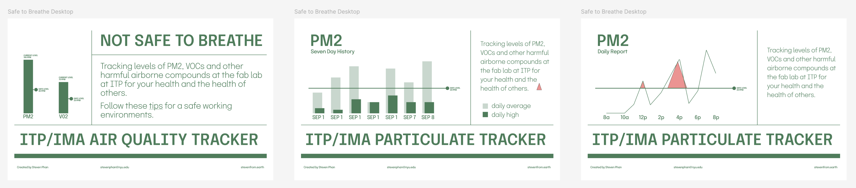
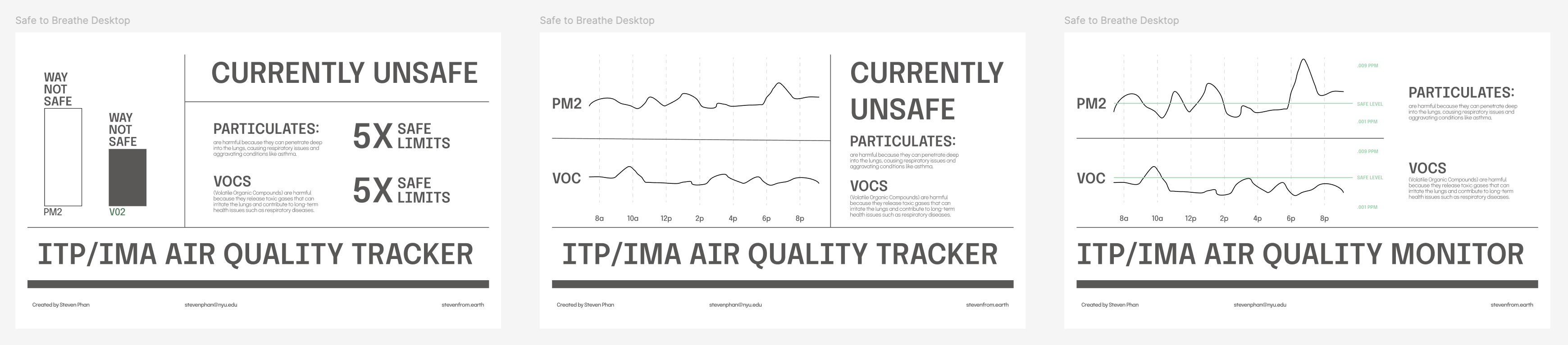
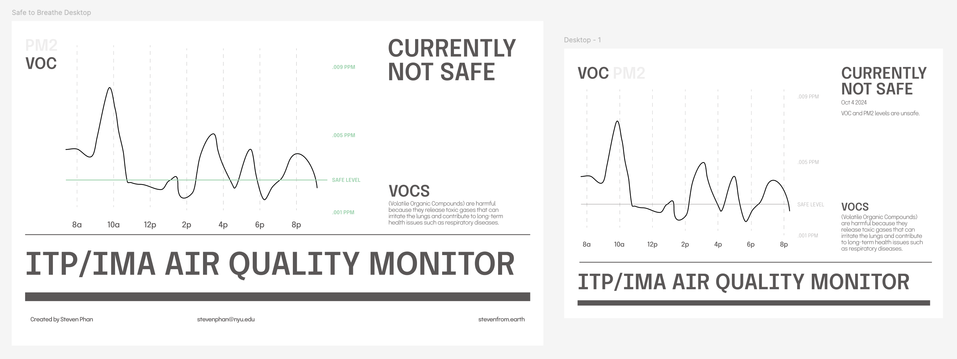
Title Block and Description So that the app can serve as a standalone experience without our narrative, the experience would benefit from a header block as well as some descriptions that give a sense for the purpose and interaction.
Potential glitch around flower starting at 0 again when window switched/maybe refreshed To investigate.
Continue improving UI Pop-up window, text styling, etc.
Improved flower appearance More unique shapes, maybe instead of just growing in size, the flower becomes more elaborate or detailed. The flower has an animation for when it reaches maturity.
Continue integrating interaction Maybe the user can affect the growth of the flower with various inputs like sunlight or water.
Persistence Build some persistent elements that can track longstanding values like “tallest flower ever”.
ML5 integration Maybe your face could be the center of the flower. Maybe your face’s position would dictate the orientation of the flower.
Animation Flowers could be more smoothly rendered. The environment could have more fun elements in motion.

Personal Reflections


It was a bit tricky for our egalitarian group (lol) to land on an overarching idea in the limited time we had available so we ended up just delegating the decision to one person – in the end that worked fine.

I think the process of collaborating on a coding project was helpful for us to dig into as relatively new coders. Working in a shared github wasn’t super complicated but if we were to try something like this again, I’d wonder if a collaborative interface might suit us better. For example, if we weren’t explicit about who was working on debugging or new features at any give moment, we’d end up with two forked projects. This happened at least once but there are probably better ways around this that we’ll learn as we approach something like this again. 

I worked mostly on UI, design and responsiveness. Some of the new skills I learned were centered around masking, layering and building responsive UI although I think a lot more could have been done to make the interface truly responsive; it was still a bit clunky. 

The act of collaborating on a technical project like this was tricky because we were designing the ship as we built it. An example of where this became a challenge was in integrating responsiveness. All of our component values needed to be proportionally represented in order for this to work correctly but that wasn’t how many components were built by the team. In the end, I think its a good lesson to always try and stray away from hard coded values. I can see how this type of issue could get out of hand in a more complex project. The critical thing that we should have been focused on integrating was some set of instructions to give our users some understanding of what the project was about. We adhered to the project criteria pretty literally but didn’t bear in mind the minimum criteria for good experience design. Won’t make that mistake again! 

In the end, I think things turned out pretty good. 


          reprehenderit in voluptate velit esse cillum dolore eu fugiat nulla pariatur. Excepteur sint occaecat cupidatat non proident, sunt in culpa qui officia deserunt mollit anim id est laborum.


15 December 2024Final Project

Particle


What is it? 
Particle is an on-demand, ambient interface for public and personal health. More specifically, it’s an air-quality monitoring system that relies on social contributions mapped to hard data to generate awareness and an understanding of the health of the environments we spend time within. 


As a pilot, the system has been installed in the NYU fabrication shop space to provide real-world insights to the ITP/IMA community. The project consists of sensor hardware, a projection-based ambient interface and a web experience that allows for a data deep dive and user contributions. 


The project compels us to question our built environments and the materials and practices we employ in our everyday lives as they relate to our long-term health and well-being. Particle’s interface – spanning between projection and our devices – provides stakeholders with an experience that is on-demand and informative as needed. 

Production Decisions

I explored several avenues for how I might bring this project to life and at times I went so far as to consider ML5 for how a projection-based interface might be interacted with. In the end, I decided to keep things simpler. There are two “routes” that I imagine someone might approach this experience. 

1/ I plan to use a projection for a simplified version of the index page that I hope to cast in or near the fabrication shop at ITP/IMA. 

2/ The broader site reads as a more fully-formed website with several pages. The Now/Main page is designed to provide visitors an at-a-glance understanding of the quality of air at present. The Past page offers a graph view across any one entire day. Both offer benefits depending on the level of data fidelity and precision one is looking for. An info page offers more insight into the data the project is gathering and some reasons why the project is important. Lastly, a Submit Report page gives stakeholders on the floor an opportunity to contribute an air quality observation that can be mapped to the timeline on the Past page. This gives the community a helpful way to corroborate data events with anecdotes from the floor (etc. a fire in the laser). 

Technically, the project got a bit cumbersome. The main page involves a CSS and JS based circular visualization. That’s layered atop a Babylon.js based particle system. Both are mapped to real-time data to give an at-a-glance understanding of the current air quality in the fabrication lab. 

On the Past page, a D3.js graph represents data over the course of the present or any past day. The graph allows the user to swap between any one of the metrics that are being tracked inclusive of the indexed value that is built from a normalization of each of the original metrics. 

The Submit Report page connects to the same Firebase database that Index and Past connect to and stores any anecdotes submitted by the community. 

Challenges and Solutions

The most difficult challenges were around the complexity of matching my Figma designs in code and in configuring and accessing the Firebase database. Other major long standing challenges had to do building the visualization on the index page. With multiple objects and colors layering, the end result was unpredictable and sometimes pretty ugly. I streamlined my ambition and was able to get that under control eventually. 

Luckily LLMs were extremely helpful in overcoming many of the errors and other hurdles I faced.  

Next Steps


  • I’m looking forward to building a mobile version of the site so that it becomes more accessible to all. 
  • I want to continue to dial in the metrics being tracked and normalize them so that the data presented to users is normalized. I think it’s important to have confidence in the data before I 
  • make any claims about the status of air on the floor.
  • The responsiveness of the page could continue to be improved. 

References and Credit 


Links

Here’s the github link

Here’s the live site


Copyright © 2024

Steven Jos Phan
Instagram

Linkedin
Imagine the piece as a set of disconnected events